Sample layout — not an actual client project
All work
HEALTHCARE
Dental clinic website
The booking button stays in view on every screen
- Market
- Türkiye
- Sector
- Healthcare · dental clinic
- Year
- 2026
About the project
A clinic operating in Istanbul since 2013. There is exactly one metric here: the appointment. Everything else — the dentist, the treatment list, the address — exists to make that decision easier.
How it is built
- 01
Booking never gets lost
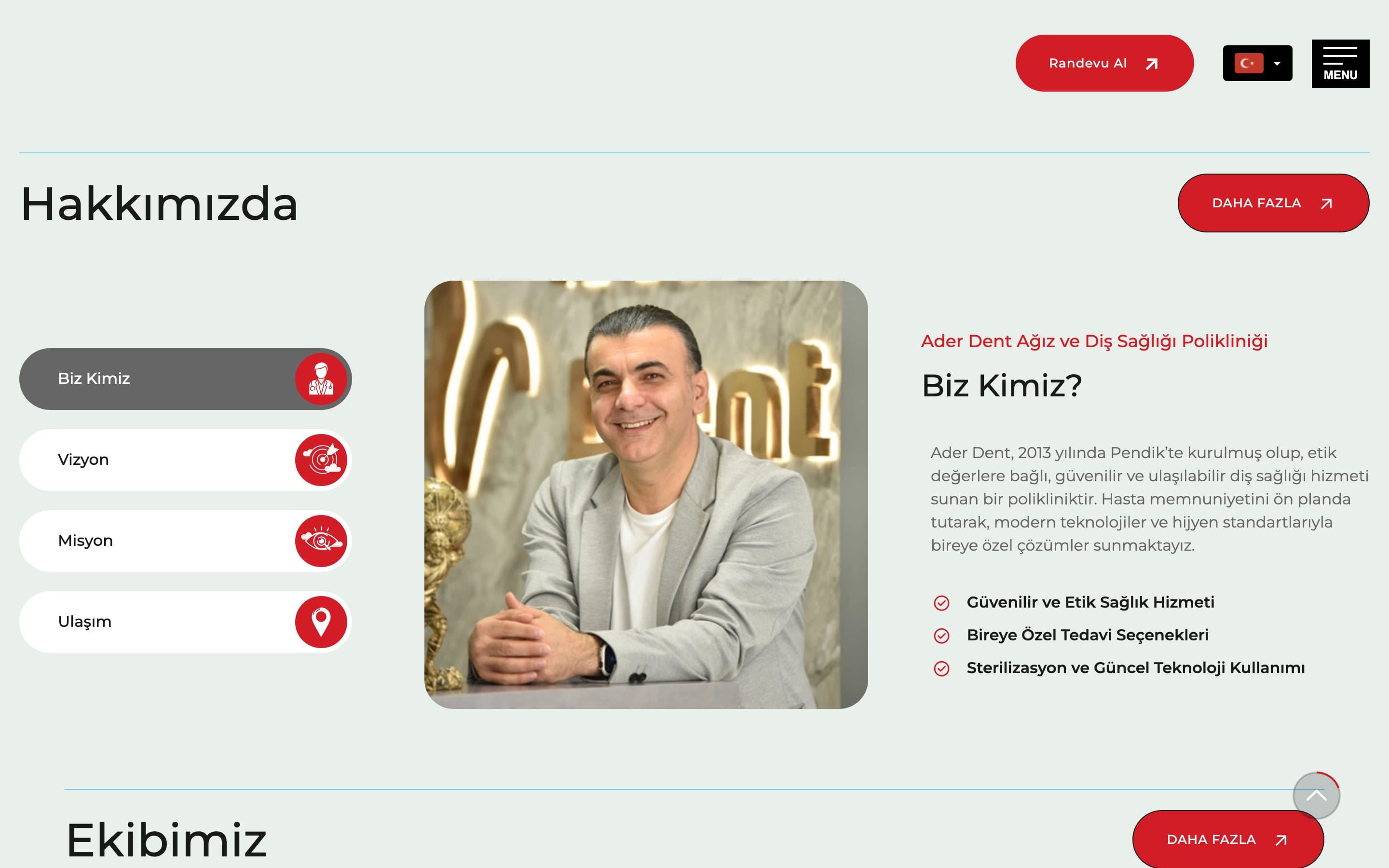
A pinned button top-right on desktop; a Phone · Book · Mail bar along the bottom on mobile.
- 02
Trust through tabs
Who we are · Vision · Mission · Getting here — four questions, one block, no endless page.
- 03
Show a face
The dentist in a real photo inside the real clinic. No stock imagery, so the claims read as true.
Details
One accent colour against a neutral light ground. The language switch sits in the header: visible to an international patient, unobtrusive to a local one.